
Responsive Web Design
Responsive web design is something about providing optimal viewing experience to the people. That means easy reading and navigation with minimum resizing and scrolling over the wide range of devices.
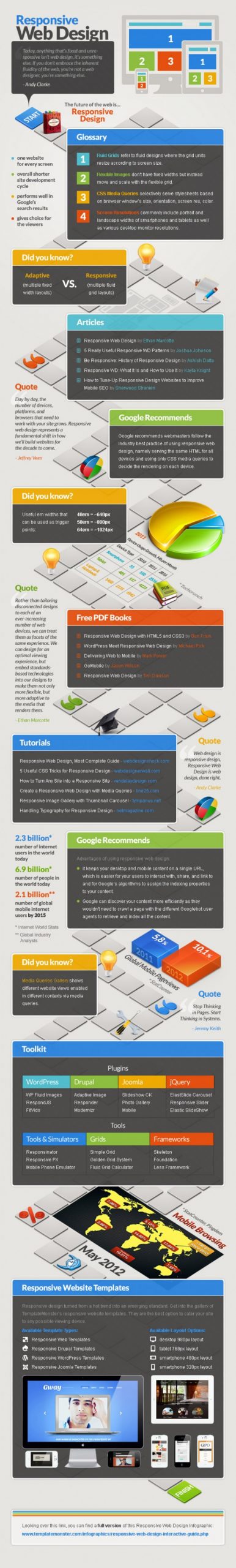
The four Important Features of Responsive Web Design
Fluid Grids:
Refer to the fluid design where the grid units resize according to the screen size. That perfectly makes one website for every screen size. That means your website itself resized according to the screen size of the various screens.
Flexible Images:
Here your web pages don’t have fixed widths instead move and scale with the flexible images. This one is known as overall shorter site development cycle.
CSS Media Queries:
Selectively serves style sheets based on browser window size, orientation, screen resolution and color. This one performs well in Google search results so that the search engine crawler can easily identify your website and listed in the top position.
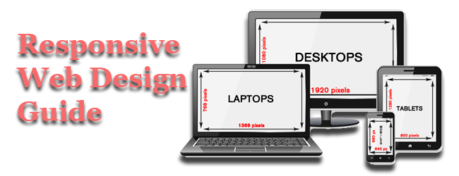
Screen Resolution:
This one gives choice for the viewers. The screen resolution is commonly include portrait and landscape widths of smartphones and tablets as well as various desktop monitor screen resolutions.
Different Between Adaptive and Responsive Web Design
The main difference between the adaptive and responsive web design is that, adaptive design having multiple fixed width layout but responsive design having multiple fluid grid layout.
Google Recommends for Responsive Web Design
The following are the Google recommends for the web designer to make them work better and useful to the customer
- Webmaster must follow industry best practices of using responsive website design, namely serving the same HTML for different devices and only using CSS media to choose the rendering for the particular devices.
- The em widths that can be used to trigger points are:
40em=~ 640px
50em=~800px
64em=~1042px
Benefits of Using Responsive Web Design
- It keeps your desktop and mobile content in a single URL, which is easier for your user to interact with, share and link in Social media like Google+ and Facebook and also for Google’s algorithm to assign the indexing properties to your content.
- Using of responsive design leads us to, Google can discover your web page more effectively as they wouldn’t need to crawl a page with different Google bot user agents to retrieve and index all the elements.
- Top 5 Google Ads Business Growth Plan in 1 Month - April 23, 2021
- Why Your Fashion Brand Needs Professional Website Design? - April 5, 2021
- #14 Powerful Digital Marketing Trends for businesses in 2021 - March 17, 2021